2019 Gauteng provincial election results
-
- Date of publication: 31 May 2019
- Download map


In May 2014, GCRO released a series of ‘dot-density’ maps that plotted the spatial distribution of votes in the 2014 provincial elections. Here we repeat this exercise, this time comparing the distribution of votes in the 2019 provincial elections against that in 2014 for the five top parties – the African National Congress (ANC), Democratic Alliance (DA), Economic Freedom Fighters (EFF), Vryheidsfront Plus (FF+) and Inkatha Freedom Party (IFP).1
As context, the table below summarises the overall results in Gauteng for the last four elections. The 2011 and 2016 elections were for municipal councils, while 2014 and 2019 were for the national assembly and provincial legislatures. National and provincial elections happen at the same time every five years, but on different ballots. The 2014 and 2019 columns in the table only give the results for the provincial ballot. How Gauteng voted on the national ballot does not form part of this Map of the Month analysis.

It is a feature of South African elections that national and provincial polls tend to see significantly higher turnout rates than those for local government. In 2019 some 4,3million of 6,4million registered voters cast their ballots, giving a turnout rate of 68%. This was relatively low by historical standards. So while 754 562 more voters went to the polls in 2019 than in the 2016 local elections (a 21% increase in the number of voters), the turnout was 67 076 less than in the last provincial elections in 2014 (a 2% reduction).
The headline story from this election has of course been that both the two main parties – the ANC and DA – saw declines from the previous provincial election, while minority parties EFF and FF+ saw significant gains. The ANC lost 180 311 votes (-8%) between 2014 and 2019, with its share of total votes cast declining from 53,6% to 50,2%. The DA, more unexpectedly, lost 163 258 votes (-12%) over the same period, resulting in its support declining from 30,8% to 27,5%. What is perhaps more interesting is that the ANC gained 530 668 votes (+32%) between the 2016 local elections and the 2019 provincial election. This by itself is not surprising, given the relatively higher turnouts in national and provincial polls – the party saw a similar increase between 2011 and 2014, even with the arrival of the EFF on the political stage. However it is remarkable in light of the fact that the DA lost 135 689 votes (-10%) over the same period.
The two big winners in the 2019 election were the EFF and the FF+, albeit off a comparatively much lower base than for the ANC and DA. The EFF racked up 183 069 (+41%) more votes than in 2014 and 234 052 (+58%) more than in 2016. The FF+ roughly tripled its support from earlier elections, up 101 408 votes (+193%) from 2014 and 113 130 (+278%) from 2016. The IFP saw a marginal gain over previous elections.
How do these shifts play out geographically? Download the map here to see a high resolution PDF, and flip back and forth between 2014 and 2019 to see the spatial changes between this provincial election and the last. This map is fully zoomable, allowing for a close look at any specific part of the province.
Our map is different from others that have been released in the public domain, like that from the Independent Electoral Commission (IEC) itself that only shows which party won each voting district (see here). In our map the votes for each of the top five parties are shown per voting district, with one dot representing 20 votes, and votes for each party represented by a different colour. This means that it is possible to see exactly where parties won votes, even if they did not win particular voting districts as a whole. Note that the dots representing votes are randomly distributed within the voting district polygon by the GIS software ‘dot density’ tool. All votes associated with a voting district are cast in one specific place – the voting station – and there is no way whatsoever to tie the votes cast in that station back to individual voters’ residential addresses. Since the dots are randomly allocated across the area, any apparent clustering for any party in one portion of a voting district is a false impression resulting accidently from the randomisation process. That said, voting districts are very small in many parts of the province, and so looking across districts it is possible to see clear geographic concentrations of support for particular parties in certain areas.
Also note that the GIS software (using the ‘dot density’ tool) does not represent dots for each political party as successive layers placed one above the other. This would have distorted the visual, giving more prominence to whichever party was arbitrarily on top. The tool not only randomly distributes the dots across the voting district; it also randomly places the dots in relation to one another, so that in some cases ANC dots will be in front of EFF dots, in other cases behind, and so on for other parties.
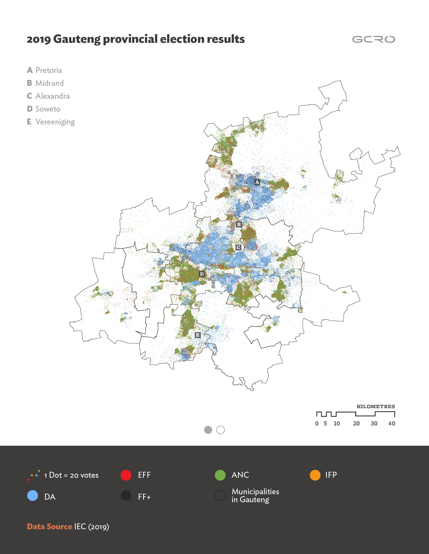
At its most zoomed-out, Gauteng-wide scale the map shows a spatial distribution of ANC and DA votes that is largely consistent between 2014 and 2019. Following established racial geographies, and the political identities that typically attach to these, ANC votes (shown with green dots) concentrate in township and informal settlement areas, whereas DA votes (blue dots) predominate in traditional suburban areas. There are of course DA votes visible in townships, and ANC votes visible in suburbs, but the growth in each direction does not seem to have been very significant between 2014 and 2019.
IFP votes (orange dots) concentrate noticeably in very specific locations – a few spots in Soweto and along the industrial/mining belt running east-west in central Johannesburg. These are hostels where IFP support has historically been entrenched amongst migrant workers. The orange in these specific places seems to have consolidated and enlarged very slightly between 2014 and 2019, suggesting that the slight increase in IFP votes does not equate to a diversification and wider geographic spread of support for the party.
The most visible change between the two maps is the increase in support for the EFF and FF+. There are a lot more black dots, representing the FF+, in areas previously dominated almost exclusively by blue dots (the DA). This is particularly noticeable in northern Pretoria (A on the main map), the western parts of Johannesburg (the blue area above D), and around Vereeniging (E). And there are significantly more red dots, representing the EFF, especially but not only in township areas.
Three pairs of zoomed-in maps below – one pair for a part of Tshwane, one pair for central Johannesburg and the western part of Ekurhuleni, and another pair for Emfuleni – illuminate these key changes. One part of the pair shows the distribution of votes in 2014, the other in 2019. Here each dot represents 2 votes, so the spatial distribution of votes is much more clearly illustrated. On these more detailed maps the voting district boundaries (slightly different in 2014 and 2019) are shown.
In the two zoomed-in Tshwane maps the inclusion of many more FF+ votes into areas historically dominated by the DA is dramatically evident, especially in the northern parts of Pretoria. The same can be seen in the Emfuleni map, especially in and around Vanderbijlpark.
The growth of the EFF is very clear across all three zoomed-in map pairs. In the 2014 map for Johannesburg / Ekurhuleni one can see that the EFF already had a strong presence in Tembisa in the last election. Similarly, the 2014 Tshwane map suggests that the EFF was reasonably well established in Atteridgeville five years ago. The 2019 versions of these maps indicate that the party has kept and grown its support in these areas. Yet there were many township, informal settlement and other areas across the three maps where relatively little EFF support is visible in the 2014 maps, but where the 2019 versions reveal considerable growth. For example places like Mamelodi (in the Tshwane maps), Daveyton and KwaThema (in the Johannesburg / Ekurhuleni maps), and Orange Farm, Evaton, Sebokeng and Sharpeville (in the Emfuleni maps), are all now a lot more red than before.
The maps suggest two aspects of growing EFF support that are worth highlighting. First, consider the distinctive new patch of red dots in Kempton Park in the Johannesburg / Ekurhuleni map pair. There was no EFF support in this area in 2014, and at first glance it might appear that all the voters in this voting district have switched their support from the DA to the EFF! The only plausible explanation for this apparent anomaly, based on an analysis of historical Google Earth imagery, seems to be that a large informal settlement has been established in the middle of suburban Kempton Park between 2014 and 2019. It is most likely that this settlement has contributed a large number of EFF votes which, in this dot-density mapping, get randomly distributed across the whole voting district.
Secondly, growing EFF support is not only visible in townships and informal settlements. There is a considerable increase in red dots in many central city, lower-middle class suburban, or gated community areas, where there is now a mash-up with green, blue and black dots. Vanderbijlpark (in the Emfuleni map pair), Johannesburg inner city areas such as Newtown (in the Johannesburg / Ekurhuleni map), and the areas around Akasia (in the Tshwane map) all stand out in this regard. Even Sandton (in the Johannesburg / Ekurhuleni map) warrants some attention here. The phenomenon is most visible in the overview map in and around Midrand (label B). This might suggest that the EFF has growing appeal amongst lower middle and middle class African voters living outside of townships and informal areas.
There are two useful by-products from a close look at these vote distribution maps. On the one hand, looking closely at growing concentrations of ANC and EFF votes in traditionally suburban areas, or zones where there are clusters of gated communities, we can get clues as to where in Gauteng we might be seeing increasing racial diversity. Of course, it is a crude assumption that African voters will typically vote ANC or EFF, and white voters DA or FF+. There is no immutable correlation between race and vote choice, and indeed parties are trying to make inroads into constituencies that are not their historical voter base. But the most likely explanation for the a blend of votes in specific areas (shown by a mixing of dot colours) is higher levels of racial diversity.
On the other hand, changes in the geographic spread of votes between 2014 and 2019 highlights some areas of rapid urban growth. While there might be some false impression of urban expansion created by changes in the boundaries of voting districts in some areas, the dramatic extension of settlements is unmistakable in the Tshwane map pair, both west of Akasia and, more especially, south-east of Mamelodi towards what is known as the Gem Valley development. The maps therefore not only speak to the changing geography of party political support, but also to the larger spatial transformations currently underway in the region.


Thanks to Richard Ballard and Christina Culwick for comments, suggestions and edits.
Notes:
- The African Christian Democratic Party (ACDP) also won a seat in the 2019 Gauteng Provincial Legislature, with 27 196 votes. It didn’t gain a seat in the 2014 elections. It is not included in the mapping and analysis.
- Editor’s note: the making of a map of the month
This GCRO Map of the Month has gone out somewhat later than normal, and as the editor of the Map of the Month series I thought I should explain why, and in the process take the opportunity to reveal a little about what goes into Map of the Month. As producers of knowledge we tend to want to show only the well-resolved finished product. But knowledge is produced through a network of, in this case, 8 direct people, and many more indirectly, working through a series of glitches that were not initially obvious.
We try to start a map with an inception meeting two months before the scheduled publication date, followed by three weeks of drafting, two weeks of editing, and three weeks of design. In this case we did not have that luxury. As with earlier elections we intended to use this month to depict election results. The election ran on Wednesday 8 May, and we acquired voting station level data as soon as it was released by the IEC on Thursday 16 May. However in order to do the map we needed a voting district layer to allow us to plot these results spatially. Our existing layers were no longer valid because the voting districts had been re-drawn. We acquired the voting district shapefile from the IEC on Thursday 23 May, a week before the end of the month deadline.
Samy Katumba prepared the maps over several days and then exported them from the GIS software (ArcGIS) to Adobe Illustrator which our design company (Breinstorm Brand Architects) uses. We received a first draft from Breinstorm within a day. After a few hours of discussing colours and other details, the lead author of the map, Graeme Gotz, noticed a problem. A patch on the 2019 map in the West Rand, which should have had dots representing different parties, was completely blank. The 2014 map worked fine, but the 2019 map was missing a cluster of dots. They were there in the ArcGIS work we had done on our side but they were not translating into Adobe Illustrator. Attempts to re-export the map did not work.
Our colleague Gillian Maree, who was not initially on the team, offered to help out. After several hours of investigation, she and Sammy identified a single voting district which was not working properly, because the shape for the voting district was not being properly read by the software at the point when it was being converted to Adobe Illustrator format. They attempted to use a feature in ArcGIS to repair the fault, but this crashed Samy’s computer. Gillian was able to do more work on the issue on her machine and they exported the file from ArchGIS to Adobe Illustrator at an A0 size (the largest sheet of paper the GIS software can work with), resulting in a file of about half a gig. But then another problem presented itself. Zooming all the way in it was clear that the individual dots had become distorted. They were either pixelated or, in other exports, different sizes or oblong in shape. The only way to resolve the problem was to increase the dot size, something we didn’t want to do because it obscured the true picture for some of the parties. Eventually we figured out that Breinstorm could render our larger dots back down to the right size, albeit with a process that had to run on computers overnight because it was so intensive.
The glitch was fixed but the project had ballooned, and was sucking in quite a lot more attention than it should have. We were still a long way out with little time before the end of the month. We wanted to do six zoomed-in maps to give a better sense of the detail of change. We resolved not to try to export to Adobe Illustrator, but rather to generate our own maps in JPEG format using colours agreed with Breinstorm. However, at this point it was 31 May. While we try and generally manage to put out our Map of the Month by the end of each month, we thought we would cut ourselves some slack on this one.
We have on one previous occasion some years ago put out a map (about a different subject) that was incorrect. We were able to replace it with a correct map within days thanks to the sharp eye of a critical reader. On a more recent occasion, we found ourselves working with a draft map that was partial in ways that none of us had properly understood. Fortunately, before the design stage, a colleague noticed that only one of five layers had been turned on, and when we did turn the other four layers on we got a very different looking picture. A map can very easily look reasonable, but in fact be representing something different to what everyone on the team thinks it is representing, or indeed be factually incorrect. We try to manage this by having a number of drafts by authors seen by colleagues and editors. If we can do this over a longer time frame we have more confidence that we are not overlooking something, although we are, in truth, always nervous that we have.
Our mailshot goes out to more than 6 000 people and we get fantastic engagement on these maps. They help us understand spatial processes in Gauteng, and at times they seem to plant thoughts with the public at large and with decision makers specifically. We do not intend for them to be didactic and closed ended, we hope that they start conversations rather than parade as a definitive answer. I thank those who produce this work and we thank you for following our map series.
Richard Ballard